Find Your Best Clothing Colors by Skin Undertone
Wearing colors that echo your skin undertone can make outfits look more balanced, brighten the face, and simplify shopping. This guide breaks down undertones (cool, warm, neutral), how to spot yours with quick tests, and how to build a wearable palette you can rely on for clothing, accessories, and everyday outfits. For more guidance, see What Are My Colours? Best Palette For Your Skin Tone, Revealed.
Why undertone matters more than skin depth
Skin depth is how light or deep your complexion appears; undertone is the subtle hue beneath the skin that stays relatively consistent (cool, warm, or neutral). Any depth can have any undertone—fair skin can be warm, deep skin can be cool, and everything in between. For further reading, see Color Analysis Blog | Expert Tips & Insights.
When your outfit colors harmonize with your undertone, the “right-color” effect tends to show up fast: skin looks clearer, shadows look softer, and features appear more defined. When colors fight your undertone, the “wrong-color” effect can make skin look dull, sallow, or overly ruddy—especially in photos.
An undertone-friendly palette also reduces decision fatigue. Instead of buying pieces that are close-but-not-quite, you build a closet where tops, outerwear, and accessories mix together more easily.
Lighting note: check color near a window in indirect daylight whenever possible. Indoor lighting can skew everything—warm bulbs push yellow, while cool LEDs can push blue—making a good shade look “off” (or the opposite).
Quick undertone checks that work at home
No single test is perfect. Use two or three and look for a consistent pattern.
1) Vein check (wrist/inner arm)
Veins that look blue or purple often point to a cool undertone; green or olive-leaning veins often point warm; a mix can suggest neutral. This is a helpful clue, but it’s not definitive—skin thickness and lighting can change what you see.
2) Jewelry test (silver vs. gold)
Silver tends to look more natural on cool undertones, while gold often flatters warm undertones. Neutral undertones usually wear both well; the better choice is the one that makes your skin look more even-toned rather than “gray” or “too yellow.”
3) White vs. cream
Hold a pure white tee and an ivory/cream fabric near your face. Cool undertones often look fresher in true white; warm undertones often glow in cream. Neutral undertones can often do either, depending on how bright or muted the shade is.
4) Sun reaction (a hint, not a rule)
Burning easily can correlate with cool undertones; tanning easily can correlate with warm. But there are many exceptions, so use this as supporting evidence only.
5) The more reliable drape test
With no makeup, compare a cool pink/berry fabric to a warm coral/peach fabric near your face in daylight. The “right” one typically reduces under-eye shadows, calms redness, and makes the whites of your eyes look clearer.
Undertone-to-color map: what typically flatters (and what to adjust)
Color harmony is about temperature (cool vs. warm), but depth (light vs. dark) and saturation (muted vs. clear) matter too. If a favorite shade feels off, try a slightly warmer/cooler version, go deeper/lighter, or choose a softer/more muted variation before giving up on the color entirely.
Cool undertones
Warm undertones
Neutral (including olive-leaning neutral)
Color guide by undertone: easy wardrobe picks
| Undertone | Go-to neutrals | Best accent colors | Use with caution |
|---|---|---|---|
| Cool | True white, black, charcoal, cool taupe, navy | Cobalt, sapphire, blue-red, berry, lavender, icy pink, cool emerald | Mustard, orange-based reds, very warm beige |
| Warm | Ivory, camel, warm beige, chocolate, warm navy | Coral, peach, tomato red, mustard, olive, teal-leaning warm greens | Icy pastels, blue-violet, stark optic white |
| Neutral | Soft white, mid-gray, taupe, denim, balanced navy | Dusty rose, jade/teal, cranberry, periwinkle, terracotta (choose muted or clear based on contrast) | Extremes: super-neon brights or very icy + very warm in the same outfit |
Build a capsule palette in 15 minutes
Step 1: Pick 3 undertone-friendly neutrals
Step 2: Add 5 weekly-wear core colors
Step 3: Choose 2 power colors
Step 4: Decide your metal and leather tones
Step 5: Use a repeatable outfit formula
Common color-matching problems and quick fixes
Foundation looks too pink or too yellow
Black feels harsh
White tees look dull
Bright colors overwhelm
Your wardrobe feels mismatched
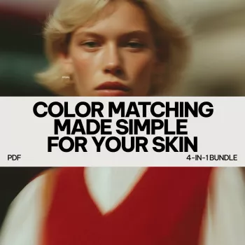
A ready-to-use color guide bundle for everyday outfits
If you want a practical, clothing-first resource organized by undertone, explore Color Matching Made Simple for Your Skin – 4-in-1 Digital Bundle, designed to separate cool, warm, and neutral palettes into easy wardrobe picks.
For complementary routines that help you coordinate makeup and overall look with your coloring, consider Data-Driven Beauty Routine Bundle and Cute Makeup Inspiration Bundle.
Color accuracy: a quick note on why shades vary
Even when two items share a color name, dye lots, fabric texture, and lighting can change how a shade reads. Standards and research around color measurement help explain why small shifts in hue and saturation matter, especially next to the face. For deeper background on color systems, visit the Pantone Color Institute and the International Commission on Illumination (CIE) Colorimetry resources.
FAQ
Can someone have a neutral undertone and still look better in mostly cool or mostly warm colors?
Yes. Neutral undertone often means flexibility, but your natural contrast (hair/eye depth), whether you suit muted vs. bright color, and olive tones can nudge your best palette slightly cooler or warmer.
How can undertone be checked if veins are hard to see?
Use fabric drapes near the face in daylight—cool pink vs. warm coral, and optic white vs. cream. Choose the option that reduces shadows, evens redness, and makes the eyes look clearer.
Do undertones change over time?
Undertone is generally stable, while surface tone can shift with sun exposure and skincare. Seasonal tanning may change which depths look best, but temperature harmony usually stays consistent.


Leave a comment